首先要说一下现在手机的UI风格,其实之前包括现在,Android的界面设计都是模仿iOS的,就拿我之前的公司,所有的UI图都是根据6s的尺寸,iOS的设计风格来设计得到,Android同学有时候就抱怨,这个好难实现,但是在iOS上,实现起来就很容易了。那么在2014年,谷歌推出了Material Desisgn,一套全新的界面设计语言,但是不少Material Desisgn的效果却很难实现,而Android中却几乎没有提供相应的API支持,于是在2015年,谷歌推出了一个Design Support库,这个库将Material Desisgn中最具代表性的一些控件和效果进行了封装,那么,今天我们就来看看有哪些常用的控件。
Toolbar是Android5.0开始推出的一个导航控件,用来替换ActionBar。为了兼容老系统,需要在build.gradle导入v7 appcompat支持库。谷歌允许开发者定制修改Toolbar,如:
设置导航栏图标
设置App的logo
支持设置标题和子标题
支持添加一个或多个自定义控件
支持Action Menu
另外,一个Toolbar就是一个View,跟其他View一样包含在布局中,并且一个Activity中可以有多个Toolbar。
任何一个新建的项目,默认都会显示ActionBar,为了取消系统自带的ActionBar,通常会更改APP的theme。例如,会直接在styles.xml文件中如此修改:
<resources >
<style name ="AppTheme" parent ="Theme.AppCompat.Light.NoActionBar" >
<item name ="colorPrimary" > @color/colorPrimary</item >
<item name ="colorPrimaryDark" > @color/colorPrimaryDark</item >
<item name ="colorAccent" > @color/colorAccent</item >
</style >
</resources >
这里直接把之前的Theme.AppCompat.Light.DarkActionBar更改为Theme.AppCompat.Light.NoActionBar,当然,你也可以修改主题的其他属性。
现在已经把ActionBar隐藏起来了,接下来在activity_main.xml上添加如下代码:
<?xml version="1.0" encoding="utf-8"?>
<LinearLayout
xmlns:android ="http://schemas.android.com/apk/res/android"
xmlns:app ="http://schemas.android.com/apk/res-auto"
xmlns:tools ="http://schemas.android.com/tools"
android:layout_width ="match_parent"
android:layout_height ="match_parent"
tools:context ="com.guiyongdong.materialdesisgndemo.MainActivity"
android:orientation ="vertical" >
<android.support.v7.widget.Toolbar
android:layout_width ="match_parent"
android:layout_height ="?attr/actionBarSize"
android:id ="@+id/toolbar"
android:background ="@color/colorPrimary" >
<TextView
android:layout_width ="wrap_content"
android:layout_height ="wrap_content"
android:text ="自定义"
/>
</android.support.v7.widget.Toolbar >
</LinearLayout >
然后在MainActivity中这样写:
public class MainActivity extends AppCompatActivity
@Override
protected void onCreate (Bundle savedInstanceState)
super .onCreate(savedInstanceState);
setContentView(R.layout.activity_main);
Toolbar toolbar = (Toolbar) findViewById(R.id.toolbar);
setSupportActionBar(toolbar);
}
}
找到toolbar,并调用setSupportActionBar(toolbar),这样既可以使用Toolbar,也可以使用ActionBar的外观。当然,你也可以不调用setSupportActionBar(toolbar),将Toolbar当成普通的View使用。
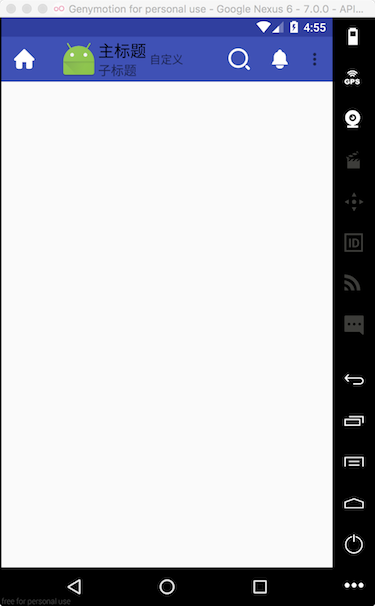
那Toolbar还可以设置哪些属性呢?
设置左边的图标 toolbar.setNavigationIcon(R.drawable.home);
设置logo toolbar.setLogo(R.mipmap.ic_launcher);
设置主标题 toolbar.setTitle("主标题");
设置子标题 toolbar.setSubtitle("子标题");
当然,它不仅可以添加自定义View,它也可以添加action按钮,如下,创建Menu resource file:
<?xml version="1.0" encoding="utf-8"?>
<menu xmlns:android ="http://schemas.android.com/apk/res/android"
xmlns:app ="http://schemas.android.com/apk/res-auto" >
<item
android:id ="@+id/search"
android:icon ="@drawable/search"
android:title ="搜索"
app:showAsAction ="ifRoom"
/>
<item
app:showAsAction ="ifRoom"
android:id ="@+id/notification"
android:icon ="@drawable/ling"
android:title ="通知" />
<item
android:id ="@+id/item1"
app:showAsAction ="never"
android:title ="item1"
/>
<item
android:id ="@+id/item2"
app:showAsAction ="never"
android:title ="item2"
/>
</menu >
在MainActivity中这样用:
public class MainActivity extends AppCompatActivity
@Override
protected void onCreate (Bundle savedInstanceState)
super .onCreate(savedInstanceState);
setContentView(R.layout.activity_main);
Toolbar toolbar = (Toolbar) findViewById(R.id.toolbar);
setSupportActionBar(toolbar);
toolbar.setNavigationIcon(R.drawable.home);
toolbar.setLogo(R.mipmap.ic_launcher);
toolbar.setTitle("主标题" );
toolbar.setSubtitle("子标题" );
}
@Override
public boolean onCreateOptionsMenu (Menu menu)
getMenuInflater().inflate(R.menu.toolbar_action,menu);
return true ;
}
@Override
public boolean onOptionsItemSelected (MenuItem item)
switch (item.getItemId()){
case R.id.search:
Toast.makeText(this ,"搜索" ,Toast.LENGTH_SHORT).show();
break ;
case R.id.notification:
Toast.makeText(this ,"通知" ,Toast.LENGTH_SHORT).show();
break ;
case R.id.item1:
Toast.makeText(this ,"item1" ,Toast.LENGTH_SHORT).show();
break ;
case R.id.item2:
Toast.makeText(this ,"item2" ,Toast.LENGTH_SHORT).show();
break ;
}
return true ;
}
}
如果我们不设置setSupportActionBar(toolbar),那么Toolbar就是当成一个View使用,就可以这样添加action按钮:
public class MainActivity extends AppCompatActivity
@Override
protected void onCreate (Bundle savedInstanceState)
super .onCreate(savedInstanceState);
setContentView(R.layout.activity_main);
Toolbar toolbar = (Toolbar) findViewById(R.id.toolbar);
toolbar.setNavigationIcon(R.drawable.home);
toolbar.setLogo(R.mipmap.ic_launcher);
toolbar.setTitle("主标题" );
toolbar.setSubtitle("子标题" );
toolbar.inflateMenu(R.menu.toolbar_action);
toolbar.setOnMenuItemClickListener(new Toolbar.OnMenuItemClickListener() {
@Override
public boolean onMenuItemClick (MenuItem item)
switch (item.getItemId()){
case R.id.search:
Toast.makeText(MainActivity.this ,"搜索" ,Toast.LENGTH_SHORT).show();
break ;
case R.id.notification:
Toast.makeText(MainActivity.this ,"通知" ,Toast.LENGTH_SHORT).show();
break ;
case R.id.item1:
Toast.makeText(MainActivity.this ,"item1" ,Toast.LENGTH_SHORT).show();
break ;
case R.id.item2:
Toast.makeText(MainActivity.this ,"item2" ,Toast.LENGTH_SHORT).show();
break ;
}
return true ;
}
});
}
}
最终运行效果如下:
DrawerLayout APP中,侧滑菜单使用的频率蛮高的,比如QQ。Android提供了DrawerLayout来实现这种效果,DrawerLayout是一个布局,在布局中允许放两个直接子控件,第一个子控件是主屏幕中显示的内容,第二个子控件是滑动菜单中显示的内容,因此,我们修改一下activity_main.xml:
<?xml version="1.0" encoding="utf-8"?>
<android.support.v4.widget.DrawerLayout
xmlns:android ="http://schemas.android.com/apk/res/android"
xmlns:app ="http://schemas.android.com/apk/res-auto"
xmlns:tools ="http://schemas.android.com/tools"
tools:context ="com.guiyongdong.materialdesisgndemo.MainActivity"
android:layout_width ="match_parent"
android:layout_height ="match_parent"
android:id ="@+id/drawer_layout"
>
<LinearLayout
android:layout_width ="match_parent"
android:layout_height ="match_parent"
android:orientation ="vertical" >
<android.support.v7.widget.Toolbar
android:layout_width ="match_parent"
android:layout_height ="?attr/actionBarSize"
android:id ="@+id/toolbar"
android:background ="@color/colorPrimary" >
<TextView
android:layout_width ="wrap_content"
android:layout_height ="wrap_content"
android:text ="自定义"
/>
</android.support.v7.widget.Toolbar >
</LinearLayout >
<LinearLayout
android:layout_width ="match_parent"
android:layout_height ="match_parent"
android:layout_gravity ="start"
android:background ="#fff" >
<TextView
android:layout_width ="wrap_content"
android:layout_height ="wrap_content"
android:text ="侧滑菜单" />
</LinearLayout >
</android.support.v4.widget.DrawerLayout >
首先,在根布局DrawerLayout里面,我们放了两个LinearLayout布局,第一个LinearLayout作为屏幕中显示的内容,里面放置了Toolbar。第二个LinearLayout就是我们的侧滑菜单,里面放置了一个TextView。但是关于第二个LinearLayout我们需要注意一点,android:layout_gravity这个属性是必须指定的,因为需要告诉DrawerLayout互动菜单是在屏幕的左边还是右边,指定left表示左边,指定right表示右边,我们这里指定了start,表示根据系统语言进行判断,如果系统语言是从左往右的,菜单就在左边。
现在就可以通过滑动屏幕的左边,打开菜单栏了。如图:
现在,只能通过屏幕的左边滑动才能打开菜单,但是,一般我们都会在Toolbar上的左边放置一个按钮,通过点击按钮也能打开菜单栏。来看MainActivity.java:
public class MainActivity extends AppCompatActivity
private DrawerLayout mDrawerLayout;
@Override
protected void onCreate (Bundle savedInstanceState)
super .onCreate(savedInstanceState);
setContentView(R.layout.activity_main);
mDrawerLayout = (DrawerLayout) findViewById(R.id.drawer_layout);
Toolbar toolbar = (Toolbar) findViewById(R.id.toolbar);
toolbar.setNavigationIcon(R.drawable.home);
toolbar.setLogo(R.mipmap.ic_launcher);
toolbar.setTitle("主标题" );
toolbar.setSubtitle("子标题" );
toolbar.inflateMenu(R.menu.toolbar_action);
toolbar.setOnMenuItemClickListener(new Toolbar.OnMenuItemClickListener() {
@Override
public boolean onMenuItemClick (MenuItem item)
switch (item.getItemId()){
case R.id.search:
Toast.makeText(MainActivity.this ,"搜索" ,Toast.LENGTH_SHORT).show();
break ;
case R.id.notification:
Toast.makeText(MainActivity.this ,"通知" ,Toast.LENGTH_SHORT).show();
break ;
case R.id.item1:
Toast.makeText(MainActivity.this ,"item1" ,Toast.LENGTH_SHORT).show();
break ;
case R.id.item2:
Toast.makeText(MainActivity.this ,"item2" ,Toast.LENGTH_SHORT).show();
break ;
}
return true ;
}
});
toolbar.setNavigationOnClickListener(new View.OnClickListener() {
@Override
public void onClick (View v)
Toast.makeText(MainActivity.this ,"home" ,Toast.LENGTH_SHORT).show();
mDrawerLayout.openDrawer(GravityCompat.START);
}
});
}
}
这里我们没有将Toolbar设置为ActionBar,但是我们设置了Toolbar的NavigationIcon,所以,我们直接给NavigationIcon添加点击事件:toolbar.setNavigationOnClickListener(),然后调用mDrawerLayout.openDrawer(GravityCompat.START)开启菜单。
如果将Toolbar设置为ActionBar,则需要在onOptionsItemSelected()方法中来处理点击事件。并且,如果你没有设置Toolbar的NavigationIcon,则需要这样设置:
ActionBar actionBar = getSupportActionBar();
if (actionBar != null ) {
actionBar.setDisplayHomeAsUpEnabled(true );
actionBar.setHomeAsUpIndicator(R.drawable.home);
}
并且此按钮的id永远是android.R.id.home。
NavigationView NavigationView也是Design Support库中提供的一个控件,也很好用。首先需要导入这个库,在app/build.gradle文件,在dependencies中添加如下:
dependencies {
...
compile 'com.android.support:design:25.3.0'
...
}
我们先来看一下运行效果:
首先我定义了一个头视图和一个menu,如下:
<?xml version="1.0" encoding="utf-8"?>
<menu xmlns:android ="http://schemas.android.com/apk/res/android" >
<group android:checkableBehavior ="single" >
<item
android:id ="@+id/search"
android:icon ="@drawable/search"
android:title ="搜索"
/>
<item
android:id ="@+id/notification"
android:icon ="@drawable/ling"
android:title ="通知" />
</group >
<group android:checkableBehavior ="single" >
<item
android:id ="@+id/item1"
android:title ="首页"
android:icon ="@drawable/home"
/>
<item
android:id ="@+id/item2"
android:title ="item2"
android:icon ="@mipmap/ic_launcher"
/>
</group >
</menu >
<?xml version="1.0" encoding="utf-8"?>
<LinearLayout xmlns:android ="http://schemas.android.com/apk/res/android"
android:layout_width ="match_parent"
android:layout_height ="180dp"
android:background ="@color/colorPrimary"
>
<TextView
android:layout_width ="wrap_content"
android:layout_height ="wrap_content"
android:text ="头视图"
android:textColor ="#000"
/>
</LinearLayout >
然后在activity_main.xml这样用:
<?xml version="1.0" encoding="utf-8"?>
<android.support.v4.widget.DrawerLayout
xmlns:android ="http://schemas.android.com/apk/res/android"
xmlns:app ="http://schemas.android.com/apk/res-auto"
xmlns:tools ="http://schemas.android.com/tools"
tools:context ="com.guiyongdong.materialdesisgndemo.MainActivity"
android:layout_width ="match_parent"
android:layout_height ="match_parent"
android:id ="@+id/drawer_layout"
>
<LinearLayout
android:layout_width ="match_parent"
android:layout_height ="match_parent"
android:orientation ="vertical" >
<android.support.v7.widget.Toolbar
android:layout_width ="match_parent"
android:layout_height ="?attr/actionBarSize"
android:id ="@+id/toolbar"
android:background ="@color/colorPrimary" >
<TextView
android:layout_width ="wrap_content"
android:layout_height ="wrap_content"
android:text ="自定义"
/>
</android.support.v7.widget.Toolbar >
</LinearLayout >
<android.support.design.widget.NavigationView
android:layout_width ="match_parent"
android:layout_height ="match_parent"
android:layout_gravity ="start"
app:menu ="@menu/nav_menu"
app:headerLayout ="@layout/nav_header"
android:id ="@+id/nav_view"
android:background ="#963" />
</android.support.v4.widget.DrawerLayout >
可以看到,我们直接把菜单换成了NavigationView,app:menu设置menu,app:headerLayout设置头视图。当然我们也可以为NavigationView的menu添加点击事件。在MainActivity.java:
public class MainActivity extends AppCompatActivity
private DrawerLayout mDrawerLayout;
@Override
protected void onCreate (Bundle savedInstanceState)
...
NavigationView navigationView = (NavigationView) findViewById(R.id.nav_view);
navigationView.setNavigationItemSelectedListener(new NavigationView.OnNavigationItemSelectedListener() {
@Override
public boolean onNavigationItemSelected (@NonNull MenuItem item)
Toast.makeText(MainActivity.this ,item.getItemId()+"" ,Toast.LENGTH_SHORT);
return true ;
}
});
}
}
这个控件可以实现悬浮按钮的效果,它默认会使用colorAccent来作为按钮的颜色,当然还可以为它指定一个图标。修改activity_main.xml:
<?xml version="1.0" encoding="utf-8"?>
<android.support.v4.widget.DrawerLayout
xmlns:android ="http://schemas.android.com/apk/res/android"
xmlns:app ="http://schemas.android.com/apk/res-auto"
xmlns:tools ="http://schemas.android.com/tools"
tools:context ="com.guiyongdong.materialdesisgndemo.MainActivity"
android:layout_width ="match_parent"
android:layout_height ="match_parent"
android:id ="@+id/drawer_layout"
>
<LinearLayout
android:layout_width ="match_parent"
android:layout_height ="match_parent"
android:orientation ="vertical" >
<android.support.v7.widget.Toolbar
android:layout_width ="match_parent"
android:layout_height ="?attr/actionBarSize"
android:id ="@+id/toolbar"
android:background ="@color/colorPrimary" >
<TextView
android:layout_width ="wrap_content"
android:layout_height ="wrap_content"
android:text ="自定义"
/>
</android.support.v7.widget.Toolbar >
<android.support.design.widget.FloatingActionButton
android:layout_width ="wrap_content"
android:layout_height ="wrap_content"
android:id ="@+id/fab"
android:layout_gravity ="end|bottom"
android:layout_margin ="16dp"
android:src ="@drawable/car"
android:elevation ="8dp" />
</LinearLayout >
...
</android.support.v4.widget.DrawerLayout >
这里,可以通过android:src指定按钮的图片,android:elevation可以指定按钮的投影度,数值越大,投影面积越大,但是投影效果越淡,反之越浓。当然,还可以为它添加点击事件,其实FloatingActionButton和一个普通的按钮一样,也是通过setOnClickListener来添加点击是事件。
AppBarLayout AppBarLayout实际上是一个垂直方向的LinearLayout,它内部做了很多滚动事件的封装。它可以通过监听滚动视图的滚动来做出响应。我们依然在activity_main.xml中修改代码:
<?xml version="1.0" encoding="utf-8"?>
<android.support.v4.widget.DrawerLayout
xmlns:android ="http://schemas.android.com/apk/res/android"
xmlns:app ="http://schemas.android.com/apk/res-auto"
xmlns:tools ="http://schemas.android.com/tools"
tools:context ="com.guiyongdong.materialdesisgndemo.MainActivity"
android:layout_width ="match_parent"
android:layout_height ="match_parent"
android:id ="@+id/drawer_layout"
>
<android.support.design.widget.CoordinatorLayout
android:layout_width ="match_parent"
android:layout_height ="match_parent"
android:orientation ="vertical" >
<android.support.design.widget.AppBarLayout
android:layout_width ="match_parent"
android:layout_height ="wrap_content" >
<android.support.v7.widget.Toolbar
android:layout_width ="match_parent"
android:layout_height ="?attr/actionBarSize"
android:id ="@+id/toolbar"
android:background ="@color/colorPrimary"
app:layout_scrollFlags ="scroll|enterAlways|snap" >
<TextView
android:layout_width ="wrap_content"
android:layout_height ="wrap_content"
android:text ="自定义"
/>
</android.support.v7.widget.Toolbar >
</android.support.design.widget.AppBarLayout >
<android.support.v4.widget.NestedScrollView
android:layout_width ="match_parent"
android:layout_height ="wrap_content"
app:layout_behavior ="@string/appbar_scrolling_view_behavior" >
<TextView
android:layout_width ="match_parent"
android:layout_height ="wrap_content"
android:id ="@+id/text_view" />
</android.support.v4.widget.NestedScrollView >
<android.support.design.widget.FloatingActionButton
android:layout_width ="wrap_content"
android:layout_height ="wrap_content"
android:id ="@+id/fab"
android:layout_gravity ="end|bottom"
android:layout_margin ="16dp"
android:src ="@drawable/car"
android:elevation ="8dp" />
</android.support.design.widget.CoordinatorLayout >
<android.support.design.widget.NavigationView
android:layout_width ="match_parent"
android:layout_height ="match_parent"
android:layout_gravity ="start"
app:menu ="@menu/nav_menu"
app:headerLayout ="@layout/nav_header"
android:id ="@+id/nav_view"
android:background ="#963" />
</android.support.v4.widget.DrawerLayout >
首先,我们修改了主布局为CoordinatorLayout,CoordinatorLayout是一个加强版的FrameLayout布局。然后添加AppBarLayout布局,并让Toolbar当做它的子布局。最后,添加一个NestedScrollView,最重要的一点是,设置app:layout_behavior属性为@string/appbar_scrolling_view_behavior,表示滚动视图在Toolbar的下面。另外,还给Toolbar添加了属性app:layout_scrollFlags,值为scroll|enterAlways|snap,其中scroll表示当NestedScrollView向上滚动的时候,Toolbar会跟着一起向上滚动并隐藏,enterAlways表示NestedScrollView向下滚动的时候,Toolbar会跟着一起向下滚动并显示出来。snap表示当Toolbar还没有完全隐藏或显示的时候,会根据当前滚动的距离,自动选择是隐藏还是显示。
CollapsingToolbarLayout
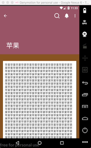
CollapsingToolbarLayout是一个作用于Toolbar基础上的布局,它可以根据滚动视图的滚动距离来改变高度。先来看一下运行的结果:
我这里创建另一个活动SecondActivity,布局如下:
<?xml version="1.0" encoding="utf-8"?>
<android.support.design.widget.CoordinatorLayout
xmlns:android ="http://schemas.android.com/apk/res/android"
xmlns:app ="http://schemas.android.com/apk/res-auto"
xmlns:tools ="http://schemas.android.com/tools"
android:layout_width ="match_parent"
android:layout_height ="match_parent"
tools:context ="com.guiyongdong.materialdesisgndemo.SecondActivity" >
<android.support.design.widget.AppBarLayout
android:layout_width ="match_parent"
android:layout_height ="250dp"
android:id ="@+id/appBar" >
<android.support.design.widget.CollapsingToolbarLayout
android:layout_width ="match_parent"
android:layout_height ="match_parent"
android:id ="@+id/collapsing_toolbar"
android:theme ="@style/ThemeOverlay.AppCompat.Dark.ActionBar"
app:contentScrim ="?attr/colorPrimary"
app:layout_scrollFlags ="scroll|exitUntilCollapsed" >
<View
android:layout_width ="match_parent"
android:layout_height ="match_parent"
android:scaleType ="centerCrop"
app:layout_collapseMode ="parallax"
android:background ="@color/colorPrimary" />
<android.support.v7.widget.Toolbar
android:layout_width ="match_parent"
android:layout_height ="?attr/actionBarSize"
android:id ="@+id/toolbar"
app:layout_collapseMode ="pin" />
</android.support.design.widget.CollapsingToolbarLayout >
</android.support.design.widget.AppBarLayout >
<android.support.v4.widget.NestedScrollView
android:layout_width ="match_parent"
android:layout_height ="match_parent"
app:layout_behavior ="@string/appbar_scrolling_view_behavior"
android:background ="#852" >
<LinearLayout
android:layout_width ="match_parent"
android:layout_height ="match_parent"
android:orientation ="vertical" >
<android.support.v7.widget.CardView
android:layout_width ="match_parent"
android:layout_height ="wrap_content"
android:layout_marginBottom ="15dp"
android:layout_marginRight ="15dp"
android:layout_marginLeft ="15dp"
android:layout_marginTop ="35dp" >
<TextView
android:layout_width ="wrap_content"
android:layout_height ="wrap_content"
android:layout_margin ="10dp"
android:id ="@+id/content_text"
android:textColor ="#000"
/>
</android.support.v7.widget.CardView >
</LinearLayout >
</android.support.v4.widget.NestedScrollView >
</android.support.design.widget.CoordinatorLayout >
我们根布局依然使用CoordinatorLayout,同样的,需要使用AppBarLayout作为Toolbar的根布局。这里,指定AppBarLayout的高度为250dp,当然,可以根据需求改动。然后添加了CollapsingToolbarLayout布局,并且指定了主题为@style/ThemeOverlay.AppCompat.Dark.ActionBar,app:contentScrim属性用于指定CollapsingToolbarLayout在趋于折叠状态以及折叠之后的背景色,其实CollapsingToolbarLayout折叠之后就是一个普通的Toolbar。app:layout_scrollFlags我们刚才也用到过,这里指定为scroll|exitUntilCollapsed,scroll表示CollapsingToolbarLayout会随着滚动内容滚动,exitUntilCollapsed表示当CollapsingToolbarLayout随着滚动完成折叠之后就保留在界面上,不再移出屏幕。
可以看到,我们又在CollapsingToolbarLayout中定义了一个View和Toolbar,其实也就意味着,这个标题栏是由普通的View加上Toolbar合成的,app:layout_collapseMode属性,用于指定当前控件CollapsingToolbarLayout折叠过程中的折叠模式,其中Toolbar指定为pin,表示在折叠过程中位置始终保持不变,View指定为parallax,表示会在折叠的过程中产生一定的位置偏移。
最后,在SecondActivity.java中,添加如下代码:
public class SecondActivity extends AppCompatActivity
@Override
protected void onCreate (Bundle savedInstanceState)
super .onCreate(savedInstanceState);
setContentView(R.layout.activity_second);
CollapsingToolbarLayout collapsingToolbarLayout = (CollapsingToolbarLayout) findViewById(R.id.collapsing_toolbar);
collapsingToolbarLayout.setTitle("苹果" );
Toolbar toolbar = (Toolbar) findViewById(R.id.toolbar);
setSupportActionBar(toolbar);
ActionBar actionBar = getSupportActionBar();
if (actionBar != null ) {
actionBar.setDisplayHomeAsUpEnabled(true );
}
TextView textView = (TextView) findViewById(R.id.content_text);
StringBuilder stringBuilder = new StringBuilder();
for (int i=0 ; i<1000 ; i++) {
stringBuilder.append("苹果" );
}
textView.setText(stringBuilder.toString());
}
@Override
public boolean onCreateOptionsMenu (Menu menu)
getMenuInflater().inflate(R.menu.toolbar_action,menu);
return true ;
}
@Override
public boolean onOptionsItemSelected (MenuItem item)
if (item.getItemId() == android.R.id.home) {
finish();
}
return true ;
}
}
修改状态栏 最初的时候,iOS和Android一个比较大的不同就是状态栏,iOS的状态栏属于当前视图的一部分,而Android却永远是黑色的。好在在Android 5.0之后,也可以对状态栏进行修改了。
要想让背景图能和系统的状态栏融合,需要借助android:fitsSystemWindows这个属性。我们需要在activity_second.xml修改布局,给View布局和它的所有父布局都添加这个属性。如下:
<?xml version="1.0" encoding="utf-8"?>
<android.support.design.widget.CoordinatorLayout
xmlns:android ="http://schemas.android.com/apk/res/android"
xmlns:app ="http://schemas.android.com/apk/res-auto"
xmlns:tools ="http://schemas.android.com/tools"
android:layout_width ="match_parent"
android:layout_height ="match_parent"
tools:context ="com.guiyongdong.materialdesisgndemo.SecondActivity"
android:fitsSystemWindows ="true" >
<android.support.design.widget.AppBarLayout
android:layout_width ="match_parent"
android:layout_height ="250dp"
android:id ="@+id/appBar"
android:fitsSystemWindows ="true" >
<android.support.design.widget.CollapsingToolbarLayout
android:layout_width ="match_parent"
android:layout_height ="match_parent"
android:id ="@+id/collapsing_toolbar"
android:theme ="@style/ThemeOverlay.AppCompat.Dark.ActionBar"
app:contentScrim ="?attr/colorPrimary"
app:layout_scrollFlags ="scroll|exitUntilCollapsed"
android:fitsSystemWindows ="true" >
<View
android:layout_width ="match_parent"
android:layout_height ="match_parent"
android:scaleType ="centerCrop"
app:layout_collapseMode ="parallax"
android:background ="#956"
android:fitsSystemWindows ="true" />
<android.support.v7.widget.Toolbar
android:layout_width ="match_parent"
android:layout_height ="?attr/actionBarSize"
android:id ="@+id/toolbar"
app:layout_collapseMode ="pin" />
</android.support.design.widget.CollapsingToolbarLayout >
</android.support.design.widget.AppBarLayout >
...
</android.support.design.widget.CoordinatorLayout >
然后,我们还需要在主题中将android:statusBarColor属性指定为@android:color/transparent,即将状态栏的颜色设置为透明。因为android:statusBarColor属性是从API 21才有的。所以,新建values-v21.xml布局,代码如下:
<?xml version="1.0" encoding="utf-8"?>
<resources >
<style name ="SecondActivityTheme" parent ="AppTheme" >
<item name ="android:statusBarColor" > @android:color/transparent</item >
</style >
</resources >
这里定义了SecondActivityTheme,并设置android:statusBarColor。然后将这个主题添加到values.xml中,如下:
<resources >
<style name ="AppTheme" parent ="Theme.AppCompat.Light.NoActionBar" >
<item name ="colorPrimary" > @color/colorPrimary</item >
<item name ="colorPrimaryDark" > @color/colorPrimaryDark</item >
<item name ="colorAccent" > @color/colorAccent</item >
</style >
<style name ="SecondActivityTheme" parent ="AppTheme" />
</resources >
最后,在AndroidManifest.xml文件中设置SecondActivity的主题:
<?xml version="1.0" encoding="utf-8"?>
<manifest xmlns:android ="http://schemas.android.com/apk/res/android"
package ="com.guiyongdong.materialdesisgndemo" >
<application
android:allowBackup ="true"
android:icon ="@mipmap/ic_launcher"
android:label ="@string/app_name"
android:roundIcon ="@mipmap/ic_launcher_round"
android:supportsRtl ="true"
android:theme ="@style/AppTheme" >
<activity android:name =".MainActivity" >
<intent-filter >
<action android:name ="android.intent.action.MAIN" />
<category android:name ="android.intent.category.LAUNCHER" />
</intent-filter >
</activity >
<activity android:name =".SecondActivity"
android:theme ="@style/SecondActivityTheme" >
</activity >
</application >
</manifest >
运行效果如下:
总结 好了,至此关于Material Desisgn风格的控件已经学的差不多了。